📈WeatherMapping - Graphing Rolling Averages
Turning Weather Noise Into Signal with Rolling Averages
Weather data is inherently messy. Daily values swing sharply due to short-lived systems, local effects, and timing quirks that have little to do with the broader pattern. If you look at raw time series alone, it’s easy to overreact to noise and miss what actually matters.
That’s where rolling averages come in.
Rolling averages smooth short-term volatility and reveal the underlying trend and momentum in a variable. Instead of reacting to every spike or dip, you can see whether conditions are genuinely improving, deteriorating, or stalling. This is especially important for variables like temperature, precipitation, soil moisture, wind, and energy-relevant metrics, where signal often emerges over days or weeks - not hours.
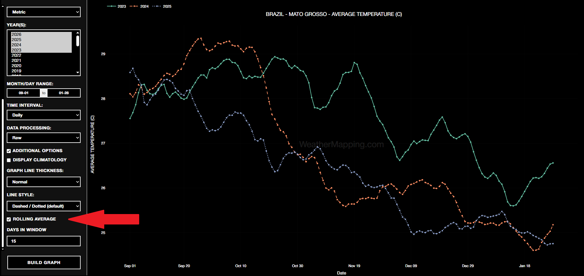
In the WeatherMapping.com graphing module, rolling averages are intentionally simple to apply. With a single control, you can overlay rolling windows on top of raw data and immediately see how chaotic series resolve into clear directional movement. What looks random at first often turns into a clean story once the noise is reduced.
This clarity helps answer practical questions:
- Is this trend accelerating or flattening?
- Are recent extremes part of a sustained move or just short-term noise?
- How does current momentum compare to prior periods?
Rolling averages don’t replace raw data - they contextualize it. You still see the full variability, but you also see the signal beneath it. For anyone making decisions based on weather-driven risk, timing, or exposure, that distinction is critical.

Less noise leads to better interpretation. Better interpretation leads to better decisions.